Industrial Design
Aura Digital Reader
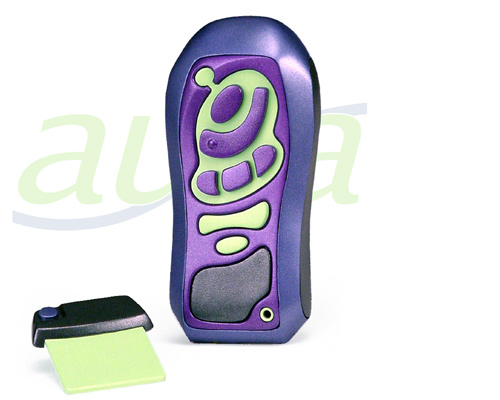
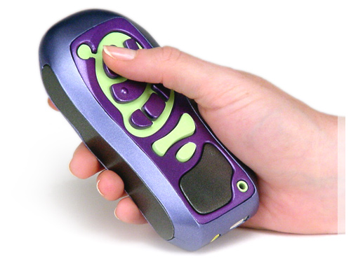
Aura: a portable digital reader developed with a universal and user-centered design approach. User research and evaluation of current products, including Talking Book Materials from the National Library Service for the Blind and Physically Handicapped, Library of Congress, identified a frequently asked user question: Why are playback machines so bulky and large? This approach also looked at the whole reading task: How, Why, Where, and What people read, and how a solution might be more portable, less intrusive to the activity, and/or controlled with a specialized interface for individuals with highly specific needs. To avoid intimidating beginning users, there are only seven buttons on the wireless phone shaped device. Of those, six are direct reading tasks.

Physical shape
Multiple foam carvings were done rapidly for ideation and user testing. Two dimensional iteration sketches refined features for further testing. Button function and design developed during the process according to user feedback about perceived affordance and ease of use. During final testing, actual target users correctly identified the function of the Read, Forward, Back, Stop, and Volume Up/Down buttons while using feel alone or sight alone - and all buttons have a self-voicing feature, a preference familiar users can turn off. The software interface was prototyped concurrently with the physical form for a complete conceptual model. Beginner users can press play (the only button with a bump) and the reader reads wherever it left off. Advanced users may navigate the task-centric menu. Items ordered in distance from task.

User story
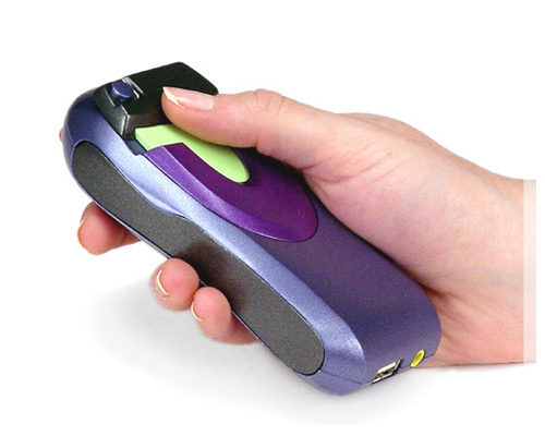
Books and magazines are stored on electronic memory card libraries, but imagine a basket full of these physically identical cards. How many libraries would you insert before finding the right one, and how exactly do you remove and insert them? Someone with blindness may not know Braille, and users with low vision may not be able to read small print. After this task analysis, the solution places a digital recording microchip in the grip of the library card. Pressing a button located off-center of, and recessed in, the library card grip summarizes the contents of that library. The grip's size is easy to grasp and physically necessitates which end of the card to insert. Additionally, the Aura digital reader has a flat area for card alignment, eliminating the usability difficulties of mid-air slot finding. Tested with actual target users. Library card may be removed with one hand.

Prototypes
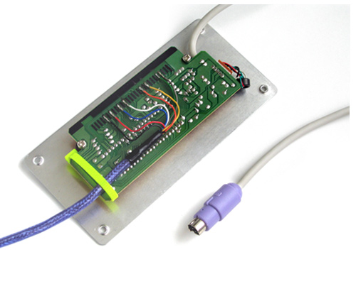
The interface was prototyped and tested with Flash using key or mouse input to play recordings sampled at various speeds for real-time feedback of forward, reverse, stop, and play. Menu items such as navigation and Book Contents selection were also prototyped. But how could the physical model be paired with this software interface for testing? There are several methods. One common method is a 'Wizard of Oz' technique where the user presses a physical button while someone else activates what that button would do, but this doesn't grasp subtle input and response discrepancies. The method developed for the later stages of this project involved taking the common keyboard used with the Flash prototype - and changing the keys into buttons. Shown here is a keyboard modified to send special inputs to the Flash prototype.