Microsoft 2012
Outlook.com
As a UX designer on a team with PM, Engineering, and Research, I designed product features for Hotmail, Outlook.com, and later Office 365, including conversation threading and categorization of incoming mail. I also designed the online People experience, worked on pixel-perfect baselines and grids, and provided patterns and alignment.
Design informed by user studies and observation
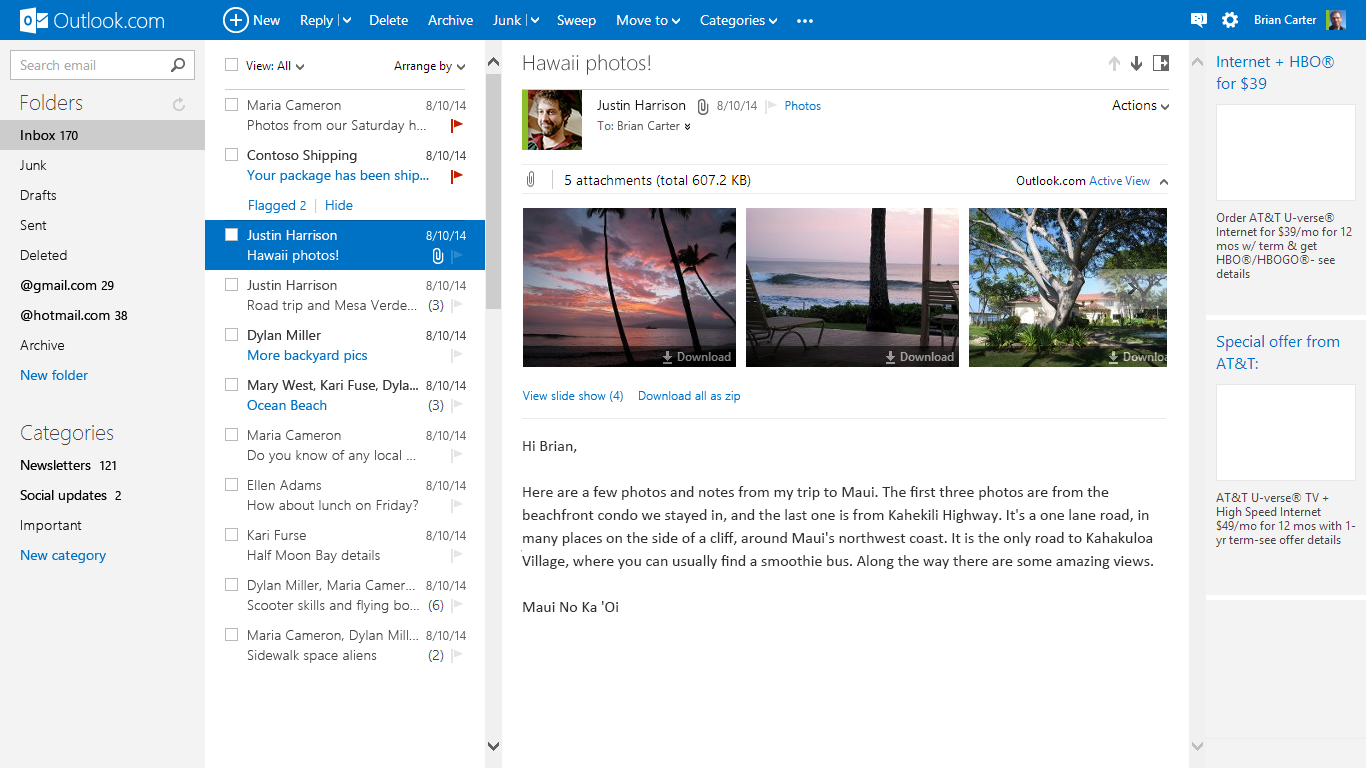
My work on Hotmail’s transition to Outlook.com involved introducing new features to hundreds of millions of users. Informed by observation, I designed user experiences for change management, commands, and message lists. Additional features included threading, categories, and improvements in newsletter reading and inbox management. This work included collaboration with Research and PM.
People experience and shared components
I also redesigned Hotmail contacts into the new People experience, simplifying connection management across different networks. I introduced persona linking across platforms, groups, and email suggestions during composition. Additionally, I collaborated with the Windows team to ensure a consistent user experience.
A pixel perfect grid via collaboration and design principles
I collaborated with Design and Engineering to achieve a pixel-perfect grid. Evaluating the system-level experience enabled coordination among multiple designers and engineers working in different areas, ensuring consistent layout alignment across features, states, and different areas. I also collaborated with Test to ensure the actual user experience matched designs.
“Outlook is gorgeous. It’s the best-designed web email service I’ve ever seen.
Outlook.com was well received. Several of the features I worked on were shown prominently in Microsoft's Get Going TV campaign, with music by Macklemore & Ryan Lewis. In 2012 Slate said “Outlook is gorgeous—it’s the best-designed Web email service I’ve ever seen.”